


Natural Logo Rhythm
As publishers, we’re constantly reevaluating our brand and our identity. We want our connection with you to remain close and fresh, so that when you see our publication, your reaction is, “Oh, yeah. These are my people. They speak my language.”
Of course, much of that reaction is derived from the content. But some of it is also from the design and how the content is presented. Over time, designs become stale. Fonts, color schemes and visual effects that were once popular become as outdated as bell-bottom pants. (Wait, never mind. I think those are back in style again. Anyway, you get my point.)
Every once in a while, a publication needs a refresh, and that’s where we’re at with PTE. It’s part of what I like to call the “Natural Logo Rhythm.” In my experience a good design for a publication lasts about 10 years or so. Any longer than that and you start to risk looking like you’re from the wrong decade. And for a publication focused on technology like we are, it’s not a good look.
The current design for PTE was introduced in 2013, so it feels right to have a fresh new look.
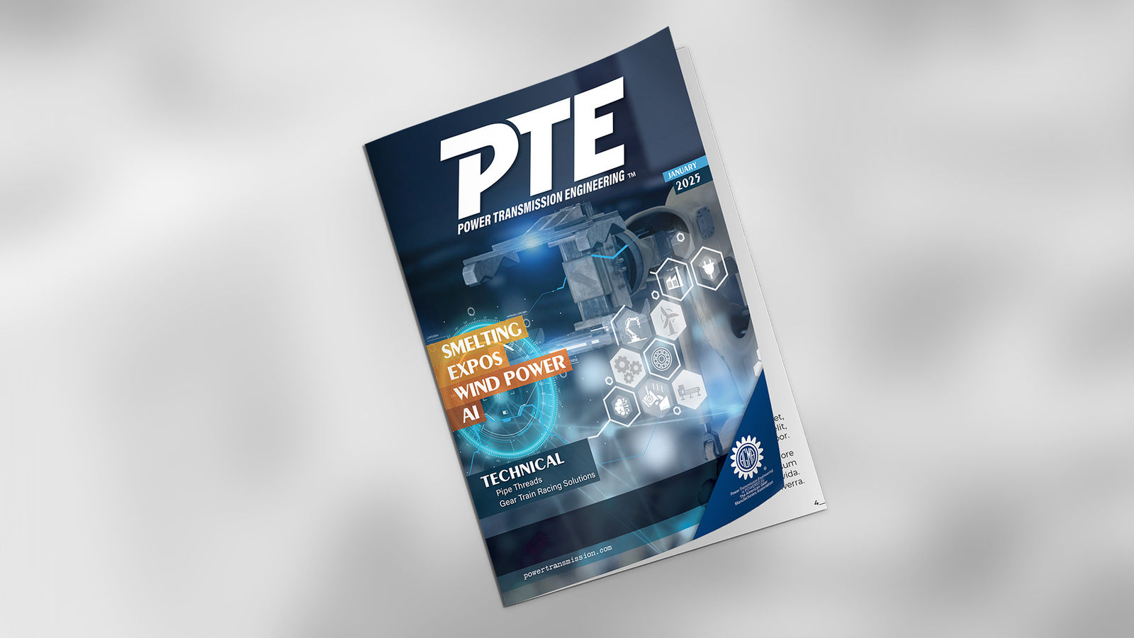
I’m pleased to announce that PTE will be unveiling that fresh new look beginning in January. Right here, right now, you’re getting a sneak preview of the new logo.
But it doesn’t stop there. The website has been completely redesigned, with an emphasis on bigger, bolder images to highlight the technologies of mechanical power transmission as well as all of the really cool applications that rely on gears, bearings, motors, gear drives and related components. We’ve committed to keeping the content on our home page fresh and engaging, so that when you come to visit, you’ll continue to find new and interesting articles as you scroll through the pages and explore the site.
